Vitty
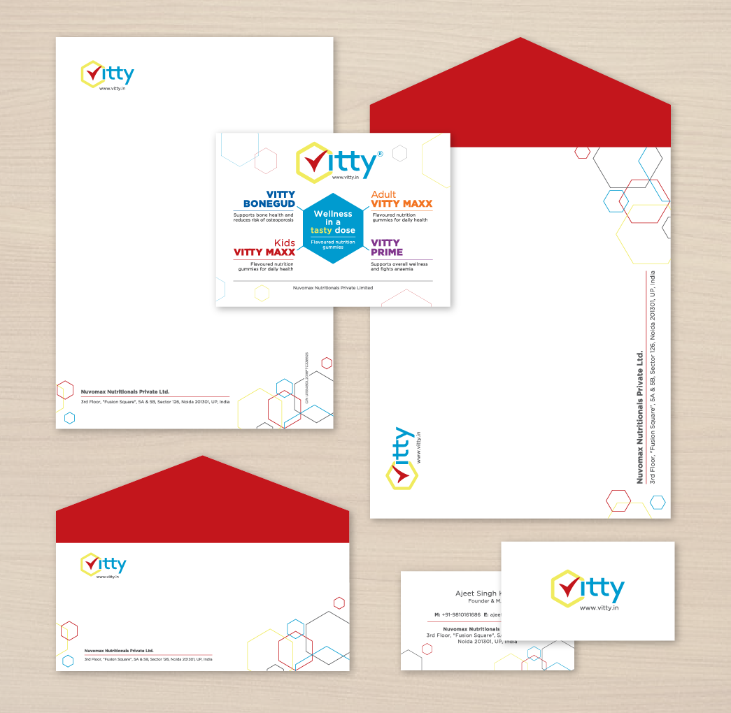
The brief: To create an identity for Vitty which produces multi-vitamin gummies for adults as well as children. The hexagon represents the cell structure of all vitamins and the V doubles up as a check mark which connotes that the nutritional requirements of Vitty consumers have been met. Primary colours have been used which represent the ‘building block’ concept of nourishment.
![]()
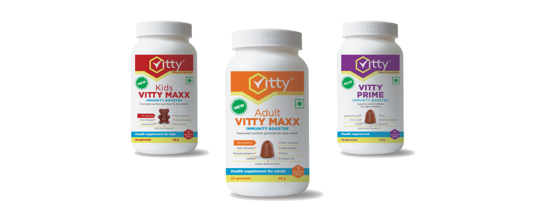
The identity was then carried forward into packaging. The goal was to communicate that Vitty is a fun and tasty way of consuming vitamins. A template had to be standardized so that the extensive range of variants offered by them could be accommodated. The brand needed to have a strong identity, creating ‘shelf-throw’ without loosing out on the details.
The UI for an eCommerce website was also designed which carried the basic DNA of the brand but also delved deeper into each ingredient and the technicalities of Checkout pages and Payment Gateways that are part and parcel of buying the finished product. All the pages can be viewed on www.vitty.in

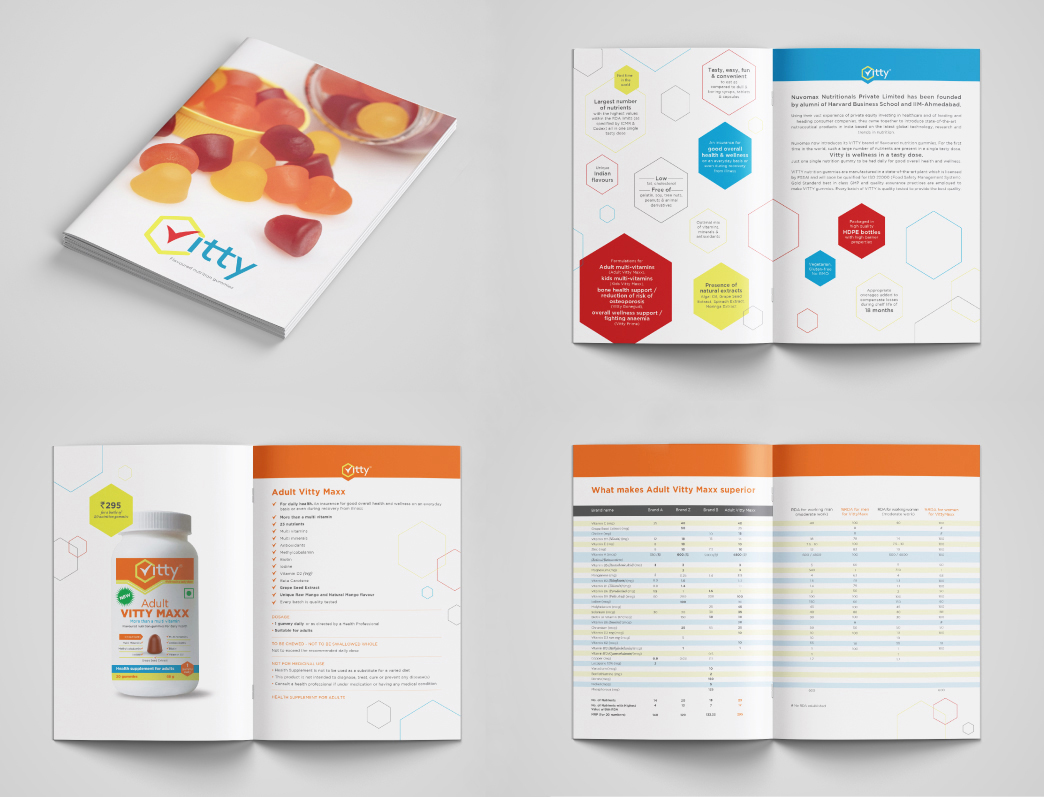
For the on-ground sales team, a catalogue was designed as well.